Summary
My Role
Design Lead
Cross-Functional Team
2 Engineers, 1 Design System Owner
Target Users
All users across the VNDLY platform
Problem
The Workday-wide Annual Accessibility Review revealed that the VNDLY platform was only 23% compliant, flagged with a high amount of critical issues, and 12% of those related to the Page Header component. However, lacking a standard approach to responsive design hindered the team from achieving consistency and predictable interactions. My goals were to redesign a component while strategically introducing new practical standards for the team.
Business Impacts
- Increased the platform’s WCAG AA Compliance by 12% within 5 months of spearheading the project;
- Drove the organization’s Strategic Growth Initiative to set Responsive as the top #1 priority for scalability & accessibilities across the entire platform;
- Established alignment with Engineers on the development plan and empowered engineers to apply new React frameworks into building scalable components;
- Increased the quality bar of the Design System contribution model by introducing new practices to document the design and implementation guidelines.
Opening
Shift People’s Perception Through Language
Language is a powerful tool in shifting and shaping people’s minds. I recognized the common misconception within the organization was: Responsive = desktop + tablet + mobile, leading to a notion of “No one would use feature X on mobile.” This made the organization resistant to comply with written UX standards despite a strong passion for serving the users.
My Approach (that actually worked!):
- Collected use cases and examples for when responsive wasn't device-based, such as “A user zoomed in 150% on desktop screen;”
- Explained the harm of device-specific verbiage;
- Introduced more inclusive terms, such as “compact devices” and “smaller screen size;”
- Showed tangible steps to achieve Responsive, demonstrated in development terms. See more in Execution.
Impacts
- Removed the device-specific excuses that had deprioritized effort on responsive designs within the Foundation and Pay teams I was assigned to at the time;
- Gained tremendous advocacy from Engineering Managers in the Workforce pillar to adopt Responsive into the core of development works.
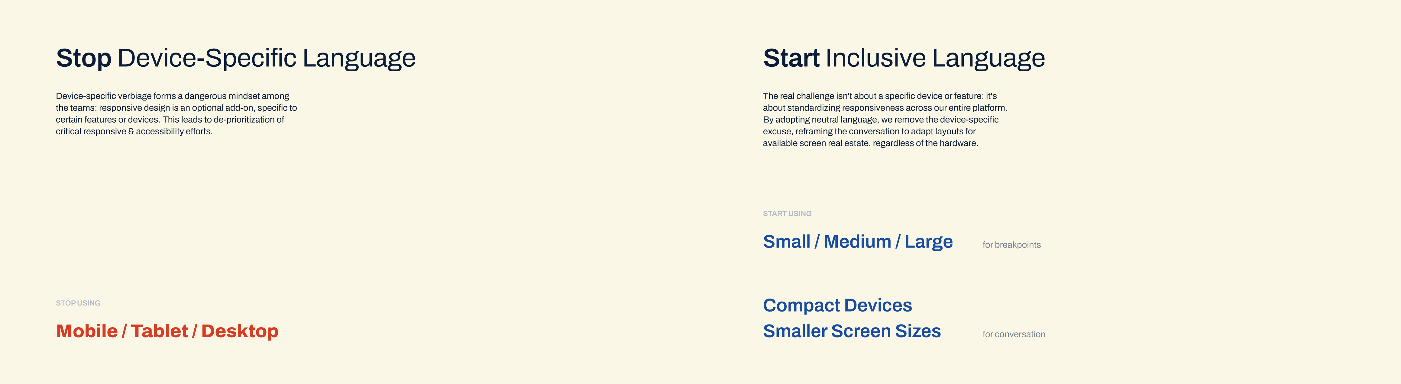
The Verbiage.
calls out device-specific language and introduces more inclusive terms for responsiveness. for example: stops calling breakpoints Mobile/Desktop; starts using Small/Large or Narrow/Wide.
Execution
Identify the Responsive Problems
The Goal: to identify what’s missing from the responsive behavior of the Page Header component, and impacts of these gaps to the user experience.
My Approach:
- Conducted a pattern analysis on over 100 page headers spanning across 11 major product areas;
- Noted common needs on a page header and outliner use cases;
- Labeled and assigned the UI elements into different abstraction levels based on the Atomic Design framework;
- Conducted Heuristic evaluation to quickly assess risks and impacts to prioritize design effort.
Problems as I found:
- Inconsistent, unstructured treatments to overflow (prioritized)
- Users unable to predict how to access overflown content—should I hover, scroll horizontally, or look for a “More” menu?
- Users unable to reach the information or use the features to complete their tasks effectively.
- Non-optimized typography & component variants
- Users got slowed down and forced into more scrolling when on more compact screen sizes.
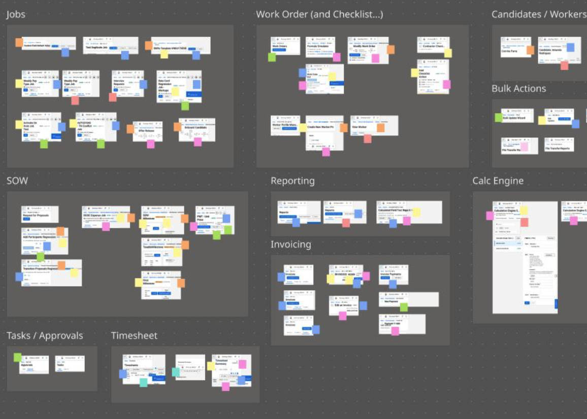
The Pattern Analysis.
images as data. I use color sticky notes to tag the exceeding content (overflow) and how it's handled. by doing so, I can assess the severity of inconsistency and identify where the responsive problem comes from, whether it's the layout, or the UI elements, or the texts—yes.
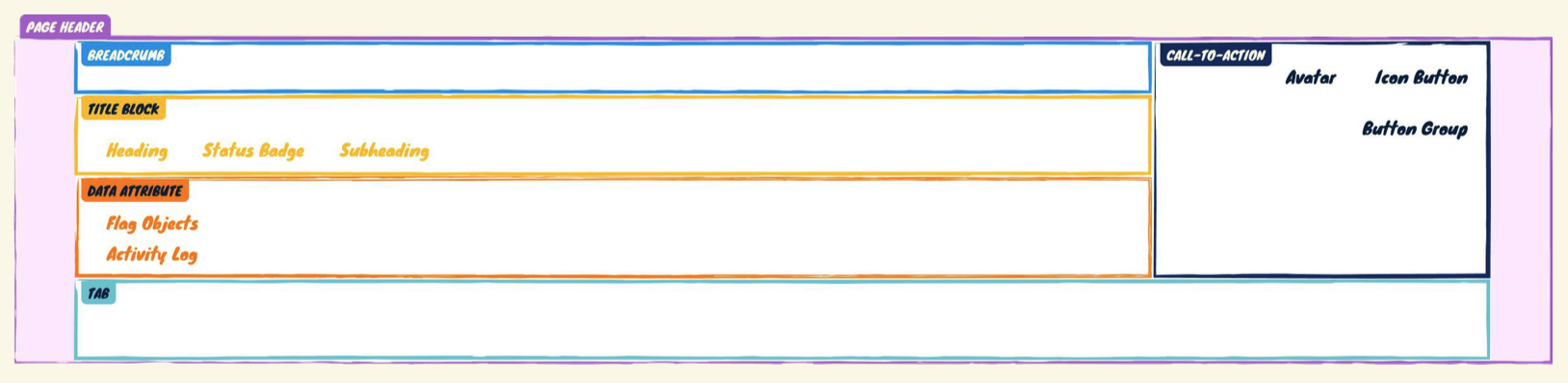
The Anatomy.
the Page Header container is an organism. each section inside, such as Title Block and CTA, is a molecule. each element inside a section, such as Heading & Button Group, is an atom. this concept is relative, the role a component plays may change depending on the level of specificity I’m trying to solve for. for example, the Button Group can be an atom here, and an organism in a different context.
Tackle Responsive Behavior at Scale
The Main Challenge: Lacked a standard approach to responsive design.
My Approach:
- Came up with a simple principle for the team to follow: to treat overflow from outside to inside;
- Documented treatment order for each child components of the Page Header;
- Visualized the expected responsive behaviors, mimicking the CSS Box Mode.
Impacts:
- Established alignment with Engineers on the development plan—in order to solve for responsive Page Header, the team had to address these underlying components;
- Empowered engineers to apply new React frameworks into building scalable components.
Kudos from the Design System squad:
Great work on the responsive header! Look forward to implementing it and making the site more responsive!
(Sr. SWE)
The Text Blocks.
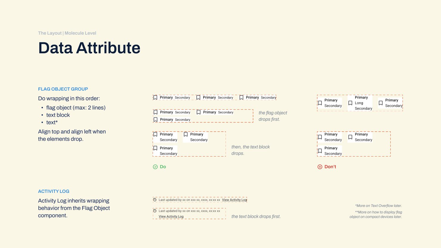
how to handle overflow for data attribute components, such as Flag Object Group and Activity Log. when the width of the group container (the outermost level) is sized down, the exceeding flag objects should be wrapped to the next line first, then followed by the text elements.
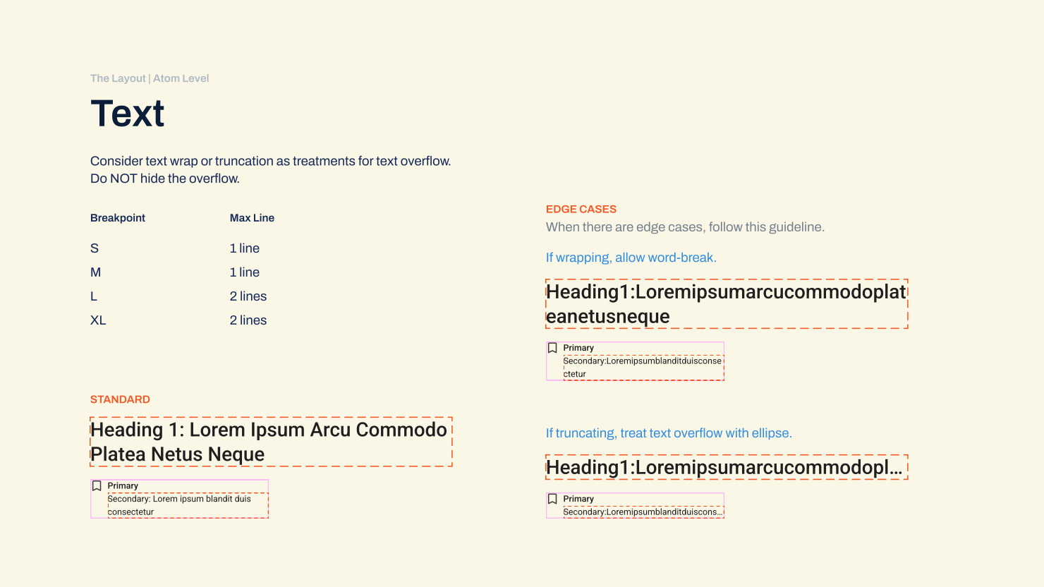
The Texts.
how to handle overflow for Text components, such as Heading in the page title and Secondary Text in a flag object. I suggest some props to handle edge cases like unusually long strings and provide instructions for when text-wrap or truncation is needed.
Introduce A New Concept of Typography System
In the VNDLY’s design system, “Heading 1” was the only typography style that was built with an H1 tag, leading to a misconception that the Page Header must use “Heading 2” or “Heading 3” to reduce the font size for smaller screens, impacting the accessibility tags, hindering the team from altering the typography system for responsive behaviors.
However, text style and text hierarchy are 2 separate dimensions, allowing the use of different style combinations for the same type hierarchy, where appropriate.
My Approach:
- Renamed the Heading text styles, from Heading 1…3 to Heading XS…XL;
- Introduced a few more styles with a proportional scale in font size.
- The page title can now use the XL style on a wide screen and the M style on narrow screens.
Impacts:
- Removed the misconception among the team;
- Enabled more flexibility in styling different heading text components.
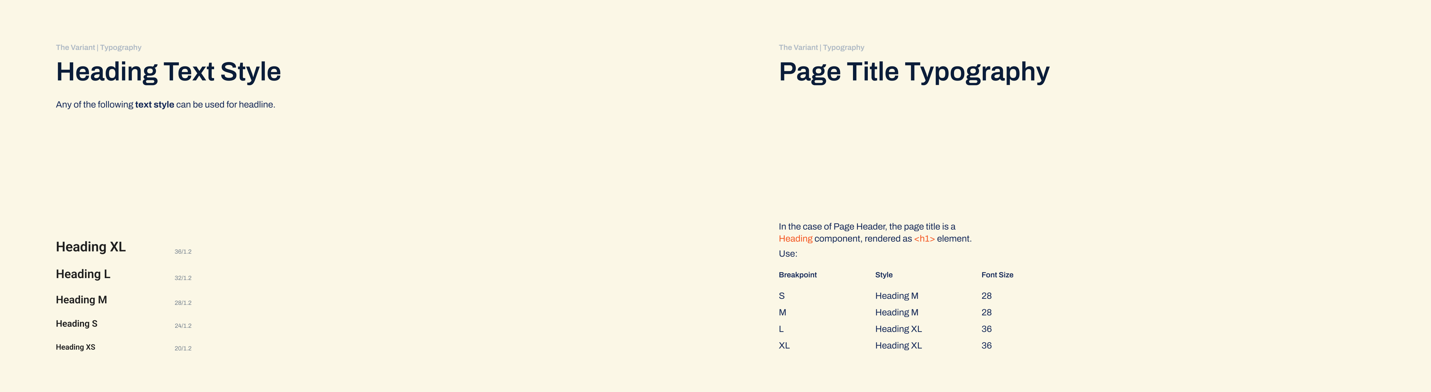
The Typography
a system of Heading text style must exist first, scaling from style XS to XL, may be varied in font size and weight. then, use these styles for the Page Title text component, which is rendered as H1 tag. the style may change by breakpoint, but it is still the same text component.
Bring Everything Together
The Main Challenge: Lacked an effective way to demonstrate responsive behaviors. (Yes, yes, even with AI-powered prototype tools at the time.)
With the Atomic Design approach, simply assembling all the children into a container, we achieved the parent Page Header component. However, anticipating what the team needed, I went further to define the responsive behavior of the parent as well.
My Approach:
- Tested both
FlexandGridlayouts, and found grids giving me greater control over different regions; - Designed the regions and spans based on collected use cases;
- In this case, on wider screen sizes (>= 1024px), the button groups needed to stick to the right edge of its container, while not “eating up” the horizontal space of the page title. An 8/4 layout could accommodate those requirements and give out a balanced look for the overall structure.
- On narrower screen size (< 1024px), simplifying the UI elements and letting them span across their container were a more appropriate approach.
- Handed off the guideline to the Design System team to build the React as well as Figma components.
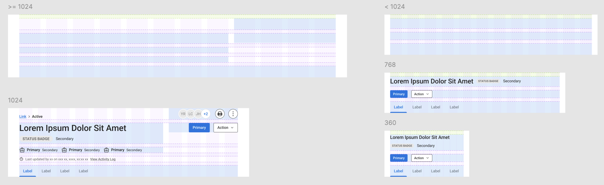
The Layout Prototype
prototype doesn’t need to be an interactive series of screens. here I abstracted the child elements and positioned them onto the 12-column grid layout, to see how much space each of them has as the parent component scales up and down.
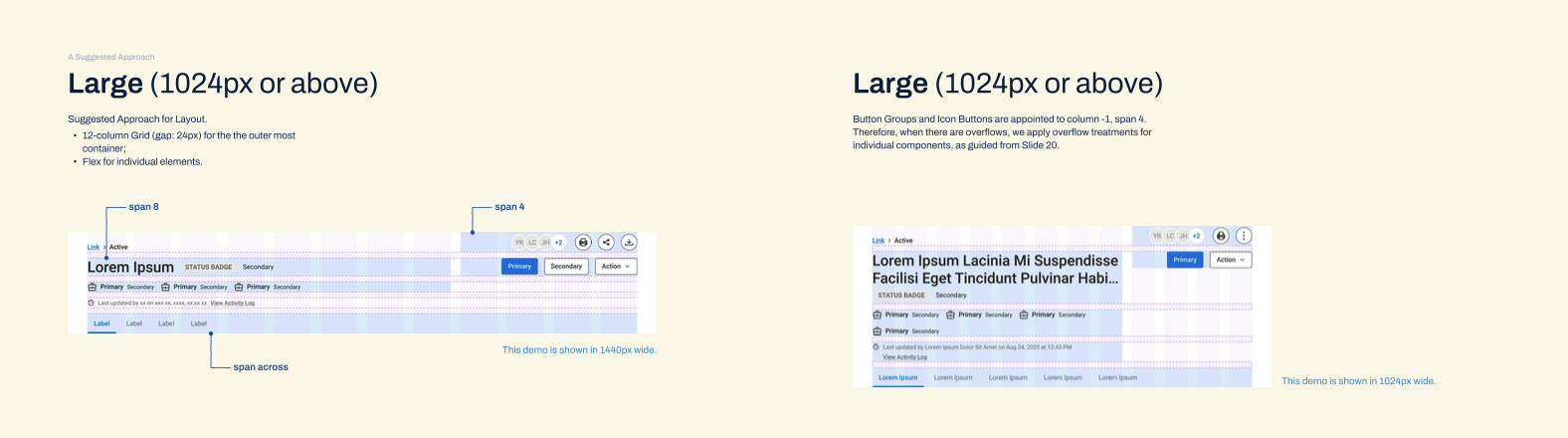
The Hand-Off (Large)
include the grids and examples for how to handle overflows at large breakpoint
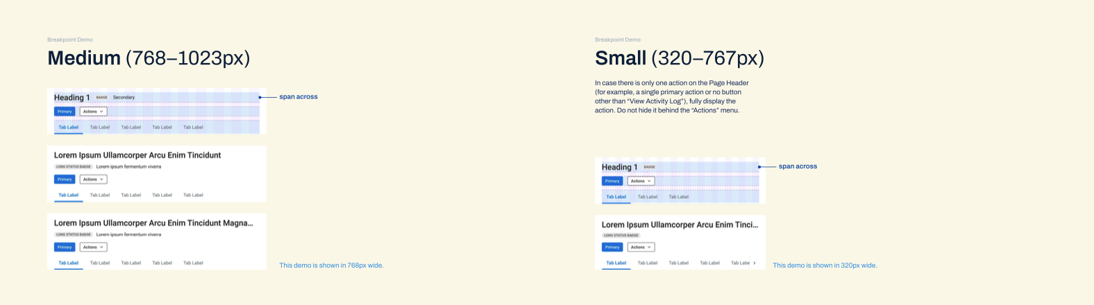
The Hand-Off (Medium-Small)
include the grids and examples for how to handle overflows at medium and small breakpoints
Kudos from the Design System squad:
AMAZING work on the Header component. You’re always pushing for things to be better, and take careful consideration in everything that you do!
(UX Manager)
Really appreciate your work on the Design System. Great to see the responsive pieces being built in and accessibility being considered a high priority to address.
(Sr. UX Designer)
Learnings
Genuine Buy-in. I realized that citing best practices or design principles isn't enough to move the needle. Authentic influence comes from grounding the "Why" in objective logic and user behavioral data.
Cross-Functional Language. To gain alignment, I have learned to present the "How" in a way that resonated with the engineering team. By illustrating design principles in technical concepts and development-friendly language, I was able to foster a more collaborative environment. This means I had to learn some markups and codes, but the time and effort really paid off!
The True Meaning of Feasibility. I discovered that technical feasibility is less about the amount of tasks and more about the clarity of the path to achieve the goal. By providing a logical, detailed plan, I enabled the team to see the path and greenlight even high-effort items.
No one yelled at me when seeing 6 child-components, which was a surprise to me, since I had prepared myself to perceive that as scope creep from 1 Page Header component. (laugh)